Deconstructing the Shot – Photo 3

This post is the third in an occasional series in which I describe the making of a photograph, from both a technical and artistic standpoint. I’ll go through the camera settings and why they were chosen, as well as the thought processes going through my head regarding composition and the creation of the image. These types of posts will be concrete examples of a previous post of mine called How Pros Photograph, which describes the various decisions that may be going through a photographer’s head as they work a scene and make photos. The first post in this series can be read here, and the second post is here.

This one can be called the Aperture Edition or Depth of Field Edition, as you will learn below.
Douglas J. Klostermann Photography
Men on Avenida el Sol – Cusco, Peru – 2008

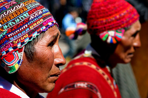
The Photo: The photo I’ve selected for this example (seen just above) is one I took in Cusco, Peru in June 2008, called Men on Avenida el Sol. It was taken during the Cusco Week festivities, which is a series of events, dances, parades, and performances leading up to Inti Raymi, the Inca Festival of the Sun that occurs each year at the solstice. The wonderful thing about this week of activities is that it offers so many opportunities for a photographer to capture cultural, dance, and people photos. And because they are all public events where people expect, and even enjoy being photographed, it eliminates the difficulties and hesitations many photographers have about approaching individuals for photographs – although that is something any serious photographer needs to overcome, and it is actually quite easy. You approach the subject, make direct eye contact, and ask, “Do you mind if I take a photograph of you?” If they speak another language, hold up and nod towards your camera with a cheerful, inquisitive look on your face. They will either agree or not – problem solved!

Although I took hundreds of photos of the events over the week, I selected this one for this exercise because I learned something very definitively in the process of capturing it. More on that later. Although great subjects and action are directly in front of you during a parade or performance, there is a bit more to capturing good photos than just clicking away. I write a bit about that, with some tips and suggestions, in this post Cambridge Carnival.

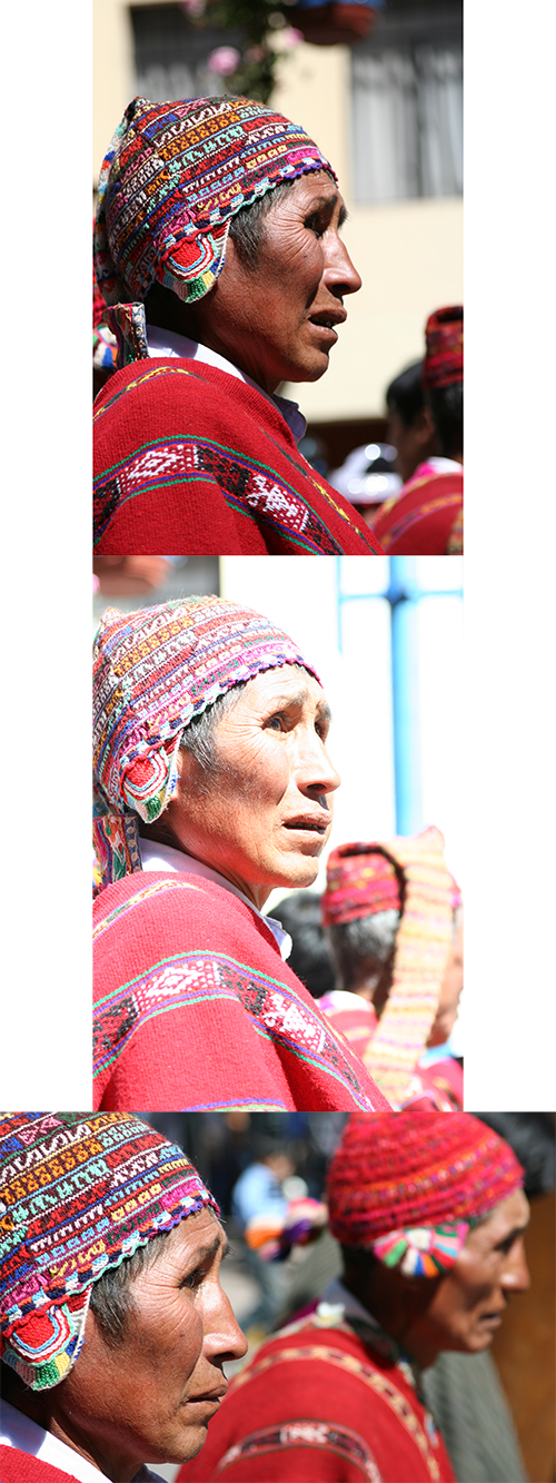
This particular event was a parade down a main street of Cusco leading into the central plaza. I’ve created some strips of photos to show a selection of images as I worked this scene:

process01

The Process: I was heading back home after taking dance photos in the plaza, and made my way down Avenida el Sol looking for additional quick shots. Most of the people and groups were standing about, waiting to move forward to perform or parade through the plaza, where the spectators were, so there were not many interesting opportunities. However, this group of older men captured my attention due to their wonderful expressive faces and their colorful traditional outfits. My intention was merely to capture these faces and subjects. However, they were a bit bored, just standing around waiting, so you can see most of the images do not really stand out.

I was using a Canon Rebel XT with a 28-105mm f/3.5-4.5 II lens. I stood on the sidewalk near the group, and set my camera on Aperture Priority mode (Av on Canon, A on Nikon). This was so I could control the depth of field and call attention to single or multiple subjects and make the background a bit blurry and less distracting. I experimented with various aperture settings, ranging from f/4.5 to f/13 depending on if I wanted one of the men to be in focus or a row of two or three of them to be in focus. A wide open aperture such as f/4.5 will have a narrow depth of field so that just one of the men is in focus, where a narrower aperture such as f/8 or f/11 will have a deeper depth of field so that the entire row of men might be in focus. With the wide apertures, I focused on the eyes of the man I wanted in-focus, and with narrower apertures, I focused about 1/3 or 1/2 way into the area I wanted to be in focus, meaning if there was a row of three faces, I focused on the middle one. The ISO was set at 200 which allowed the camera to choose fast shutter speeds of around 1/1000 s. This is because I had been capturing dance and action scenes, and wanted to be ready for the same. The metering mode was set on the general Evaluative Metering, which did a decent job of capturing the proper exposures. A couple images were mysteriously overexposed, possibly due to where I locked exposure while I was locking focus – which is why I now use a back-button focusing technique and/or lock exposures separately from focus. White Balance was set on Auto, but would have worked on Sunny as well.

As you hopefully know by now, depth of field is controlled by the aperture setting. I write more about it in these posts Depth of Field Simplified and Mastering Depth of Field. Since your specific depth of field in any situation will vary based not only on the aperture setting but also on the lens focal length and your distance from the subject, it is often difficult to predetermine what exactly is going to be in focus in the resulting image. You can try using the depth of field preview button on your camera, but it is difficult to see in the tiny, dim viewfinder what the preview is showing. You can also use your rear LCD and trial and error to view a series of experiments. But again, this is only a small screen with relatively low resolution, so it is difficult to see the precise results. And in many situations you simply don’t have the time for these methods. You just have to get a feel for your lenses and their different apertures through experience and studying your results. But one thing is certain: to get minimum, shallow depth of field and thus maximum background blurriness with any lens, zoom in as close as you can, (for example, zoom to 200mm on a 70-200mm lens) situate yourself as close as you can to your subject while still obtaining the framing you want, and use the widest aperture possible (for example f/2.8 or f/4). Work back from that if you wish to increase the depth of field – for example to have a slightly deeper depth of field in focus, use an aperture of f/5 or f/5.6, or increase your distance away from the subject, or remain close but use a shorter focal length like 28mm or 50mm.

As you can see, most of the images are very “busy,” with a lot of extraneous and distracting background people and activity. I wasn’t very pleased with the images, but I continued to take basically the same image over and over. I knew the faces, outfits, and colors were interesting, and I hoped the resulting images would be as well. I zoomed in as close as I could with most of the images, working in the 75mm to 105mm range of my lens. However, without a lens that had the 100mm to 200mm range, I could not zoom closer and could not obtain the “compression” I was looking for, where the more distant faces would appear to be closer behind the closest subject.

process02

What I didn’t do that I should have been doing, instead of trying to take the same photo over and over, was to change my position and point of view. Doing so would change the backgrounds, perhaps make them less busy or distracting (such as the spectators and the white sign), and would allow for the camera to be on the same level or looking up towards the subjects rather than looking slightly down at them.

I took a series of 60 images over a period of 7.5 minutes. Besides the selected image, only a couple other ones are mildly interesting. I knew I wasn’t capturing what I wanted, my companion was becoming impatient, and eventually I decided to move on. But then I took a few final images. My point of view had slightly changed. I was directly to the side of the men and slightly closer. The last image finally got what I had wanted. It stands out dramatically among all the other ones. It is more simple and straightforward, less cluttered, and the subjects fill the frame.
process03

The Post Process: To create the final image, I adjusted the color and contrast in Adobe Camera Raw (ACR) and in Photoshop (PS). As you can see by the unprocessed images, the color and contrast is a little dull and lifeless straight out of the camera. The original file was a JPEG file, and the Picture Style was Standard (I hadn’t started using RAW yet). In ACR, the Blacks were increased to about 7 or 10 to give it the nice deep blacks, which helps to make the bright colors pop even more. Some Recovery was used to bring back the overexposed highlights on the man’s face. Clarity and Vibrance were used to give it some, well, clarity and vibrance. In Photoshop, the contrast was increased with Curves using the preset setting of Linear Contrast. In Levels, the midtones were darkened to .93 to give a deeper more realistic color to the faces. I did some additional burning on the faces to try to reduce the hot-spots. The image was sharpened using Unsharpen Mask, probably at Amount: 85 or 100, Radius: 1, and Threshold: 4. I may have used the Hue/Saturation to reduce the saturation and lightness of the red color, though I should have done that a little more, as you can see by the man’s face which appears too red and the rear hat where the red is blown out. The Rebel XT sensor, and other digital SLR sensors often overexpose the color red. It is similar to blowing out the highlights, where the color red is blown out and there is just red and not other detail in those areas. You can use the RGB histogram rather than the brightness histogram to monitor for this on the camera’s rear LCD screen while reviewing images. I didn’t crop the image at all, as you can see. It is best to try to get the framing you want when you capture the photo, especially when using an 8 megapixel camera that doesn’t allow for much cropping! (A cropped image would have much lower image quality because the resulting resolution would be much less – it would not allow for much manipulation, and would appear pixellated when enlarged.)

The Final Image:
Douglas J. Klostermann Photography
Canon Rebel XT, 28-105mm f/3.5-4.5 II at 93mm, ISO 200, f/5, 1/1000s

The Lesson: We should always learn from our photos, so that next time we are in a similar situation, we can create an even better image. The valuable lesson I learned in this situation, in addition to perhaps always grabbing one final frame, is to make a change when the composition is not working. Change your perspective, angle, or point of view. Zoom in or out to change the framing. Don’t continue to take the same image that isn’t working, over and over again. If the subject is interesting, there is an interesting composition that can be found to best express that subject. Mentally envision the scene from a variety of positions and angles, and move around the scene as much as possible to see the options. Some other improvements I could have made to this image include using a polarizing filter. Because I was working in the bright, harsh mid-day sun at a high altitude, this could have improved the exposure, color rendition, and contrast of the original image. Since it was overexposed a bit, causing hot-spots on the subject’s face, I should have paid more attention to my histogram and adjusted the exposure compensation accordingly, or used a different metering mode such as Partial or Spot to meter directly off the man’s face.

So hopefully you can see from this explanation and from my previous posts that photographs don’t necessarily just happen. They are created through a combination of thought processes, a series of decisions, and the application of camera settings based on these decisions and on the situation at hand.

See the Related Posts section just below for links to parts 1 and 2 in this series.  And learn more about how to take control of your camera and the images you create with my Full Stop e-book camera and photography guides.

Full Stop photography e book camera user guide Nikon Canon dSLR

Deconstructing the Shot – Photo 2

This post is the second in an occasional series in which I describe the making of a photograph, from both a technical and artistic standpoint.  I’ll go through the camera settings and why they were chosen, as well as the thought processes going through my head regarding composition and the creation of the image.  These types of posts will be concrete examples of a previous post of mine called How Pros Photograph, which describes the various decisions that may be going through a photographer’s head as they work a scene and make photos.  The first post in this series can be read here.

This one can be called the Shutter Speed Edition, as you will learn below.  For those looking to learn about Depth of Field, please also view Deconstructing the Shot post 3, the Aperture Edition.

Douglas J. Klostermann Photography
Canon Rebel XT, 28-105mm f/3.5-4.5 II at 50mm, ISO 100, f/14, 1/20s

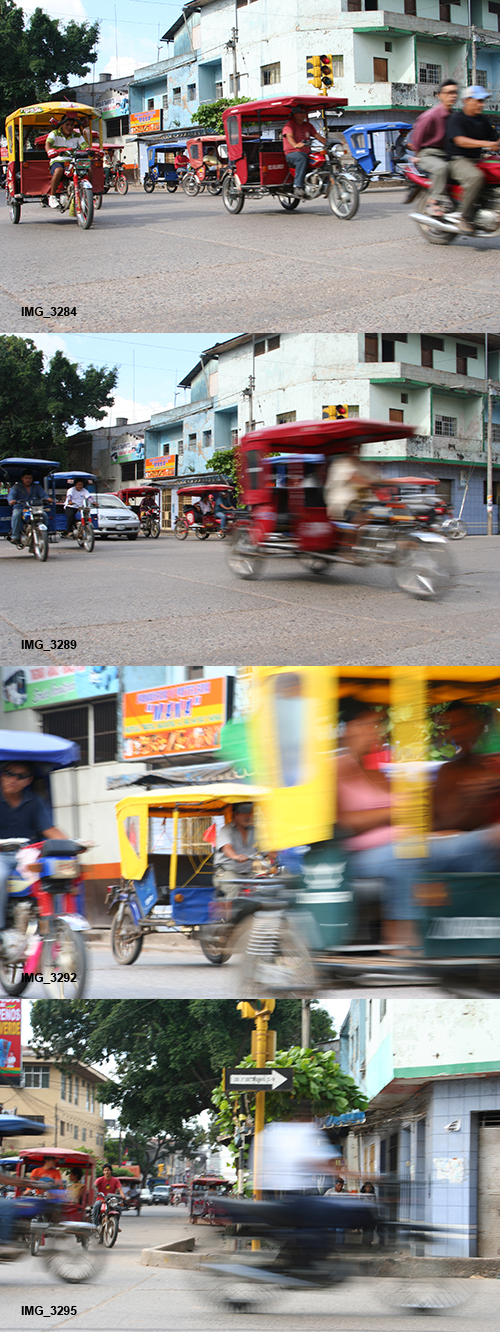
The Photo: The photo I’ve selected for this example (seen above) is one I took in Pucallpa, Peru in July 2008.  Pucallpa is a town located along the Ucayali River, a tributary of the Amazon.  Though it is a relatively small town, it has a bustling (though undeveloped) port which receives food and goods from deeper in the Amazon region.  The streets of Pucallpa buzz with the constant traffic of moto-taxis, the motorcycle rickshaws found in much of Peru and the developing world.  I had a few days before hopping on a slow boat to Iquitos, so I roamed the town looking for photo opportunities.  I’ve created some strips of photos to show a selection of images as I worked this particular scene:

Pucallpa Series 1

The Process: I wanted to capture the ubiquitous motion and activity of the traffic in the streets of Pucallpa, which is dominated by the moto-taxis.  The best way to do this, I decided, was to capture the blur of motion as the traffic sped by.  I was using a Canon Rebel XT with a 28-105mm f/3.5-4.5 II lens.  I selected a busy and interesting intersection and set the camera to Shutter Priority mode (Tv on Canon, S on Nikon).  This is so I could control the shutter speed and set it to a slow shutter speed so that fast motion would become a blur.  I initially chose a shutter speed of 1/50, but that wasn’t resulting in enough blur, so through quick experimentation, I settled on 1/20.  This shutter speed, 1/20 of a second, is very slow for hand-holding.  While the motion will blur, it is difficult at this shutter speed to hold it still enough (without a tripod) so that the background will remain sharp and not cause unwanted blur due to camera shake in the in-focus areas.  I now actually recommend using 1/30 as a starting point for creating motion blur.  But even with 1/30, you have to pay attention to holding the camera very still.  I selected ISO 100 since it was a very bright, sunny afternoon, and because I atypically needed to work in a slow shutter speed range.

I initially took some images of the traffic crossing the intersection, trying to capture many vehicles at once to accentuate my idea of the busy traffic.  However, I soon decided to face directly across the street and capture the moto-taxis as they crossed my field of view.  I set the Drive Mode to continuous so that I could fire off a series of photos each time the light turned green and the traffic crossed my view.  The Rebel XT has a slow maximum rate of 3 frames per second (fps) but many current cameras will allow a more useful and faster frame rate of 5 or 6, or even 8 fps.  White Balance was set on Auto, though Sunny setting would have worked well too.  Metering was set on Evaluative.  However, since the lighting and the scene remained relatively consistent, it would not have been a mistake to determine the best exposure then switch the camera to Manual mode, M, and set that exposure for all the photos.

In Shutter Priority mode, you choose the shutter speed and the camera will choose the aperture, based on the ISO setting.  The aperture setting for this photo wasn’t too important to me.  Since the foreground was going to be a blur of motion, it was best that the background was relatively in focus.  So a narrow aperture providing relatively deep depth of field, such as f/11 or f/16 would be fine.  Based on the ISO and the amount of light, the camera was selecting apertures ranging from f/8 to f/22 for various images, with most of them somewhere in the middle of that range.  Also, since the subject was going to be a blur of motion, there was no point in trying to focus on it.  The motion would most likely confuse the auto-focus system anyway, so I switched the lens to MF, Manual Focus, and focused on the sign post directly across the street from me.  Though I may have zoomed slightly in or out with the lens at first, I settled on a focal length of 50mm and left it there.

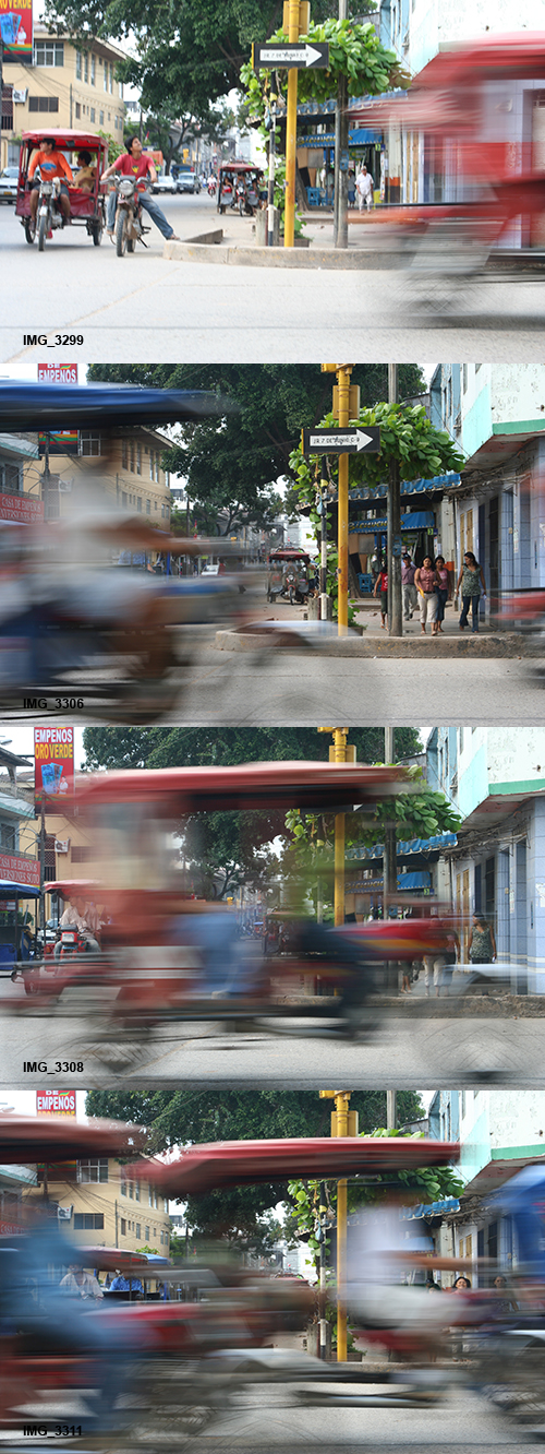
Pucallpa series 2

While the subject of this composition is the blur of the vehicles, the background also comes into play, and as with every image, can not be ignored.  The street and trees beyond created a nice background, both showing the urban context of the scene and blocking out what could have been a large area of dull, light sky.  The yellow sign post, where I focused, added a nice element of color.  You can see that the yellow post and the curb of the far side of the street lie near the “rule of thirds” lines.  This isn’t an accident, and they were consciously placed there to help create an interesting composition.  This was done through squatting or kneeling in order to place myself at the desired point of view and still capture most of the vehicles from top to bottom.

I took a series of 59 images over a period of nearly 8 minutes, with 48 of the images being the straight-on images in a period of just 2 minutes.  I used a horizontal composition since that worked best with the blur of motion of the traffic.  I typically just held down the shutter button as the traffic started to go by, just after the stoplight changed.  By doing that I captured a variety of interesting images, with the moto-taxis blurring by in all types of configurations.  In a situation like this, luck and chance play a big part.  The photographer must control all the elements they can through composition, framing, and camera settings, and then allow the scene to play out in front of them.  So I would actually call this controlled chance.  There were a few very nice results, and I settled on an frame from the middle of the series, IMG_3306, as my chosen image.  In addition to showing the blur of the moto-taxi, it also captured some pedestrians across the street and fully showed the one-way sign, which I thought were nice additions to the image.  With these added elements, it becomes more of an overall “portrait” of the city streets of Pucallpa rather than just an image about motion.

The Post Process: To create the final image, I adjusted the color and contrast in Adobe Camera Raw (ACR) and in Photoshop (PS).  As you can see by the unprocessed images, the color and contrast is quite dull and lifeless straight out of the camera.  The original file was a JPEG file, and the Picture Style was Standard (I hadn’t started using RAW yet).  In ACR, the Blacks were increased to 10 to give it the nice deep blacks, which helps to make the bright colors pop even more.  A Fill setting of 10 was used to lighten up the foreground moto-taxi a bit, and Clarity +15 and Vibrance +10 were used to give it some, well, clarity and vibrance.  In Photoshop, the contrast was increased with Curves using a setting probably close to Medium Contrast.  I typically don’t make the blacks so black and purposefully lose detail in the shadows, but I was experimenting with this look and it seemed to work well here.  The image was sharpened using Unsharpen Mask, probably at Amount: 85 or 100, Radius: 1, and Threshold: 4.  Now I would try being more aggressive with the Amount and Radius, but I am not sure the 8MP JPEG file from the Rebel XT would withstand much more without starting to degrade.  Somewhere along the way, either in ACR or PS, the color temperature was also changed to warm it up a little, which is more in keeping with the afternoon sun of the Amazon region.  I didn’t crop the image at all, as you can see.  It is best to try to get the framing you want when you capture the photo, but I am somewhat surprised myself that I did it so well.  I once had a photo teacher in college who complimented me on my ability to capture the frame and not need to crop.  I just thought that was the way one was supposed to take a photo!  Thankfully I still sometimes demonstrate that ability.

The Final Image:

Douglas J. Klostermann Photography
Canon Rebel XT, 28-105mm f/3.5-4.5 II at 50mm, ISO 100, f/14, 1/20s

The Lesson: We should always learn from our photos, so that next time we are in a similar situation, we can create an even better image.  Some improvements I could have made to this image include using a neutral density (ND) filter or a polarizing filter.  This would have given me more control over the range of aperture settings that the camera selected and allowed for a wider-open aperture so that the far distance became more of a blur.  A polarizing filter would have also helped to darken the bits of sky that appear.  And as I mentioned above, a shutter speed of 1/30 would have still created the blur, but would have been slightly easier to hand-hold without creating unwanted blur in the background due to camera shake.

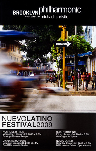
This image was chosen to be used on the cover of the programs for the Brooklyn Philharmonic’s Nuevo Latino Festival in 2009.  Incredibly, the near square crop of the image works really well too:

Douglas J. Klostermann Photography

So hopefully you can see from this explanation and from my previous posts that photographs don’t necessarily just happen.  They are created through a combination of thought processes, a series of decisions, and the application of camera settings based on these decisions and on the situation at hand – plus some controlled chance!

See the Related Posts section just below for links to parts 1 and 3 in this series.  And learn more about how to take control of your camera and the images you create with my Full Stop e-book camera and photography guides.

Full Stop photography e book camera user guide Nikon Canon dSLR

Deconstructing the Shot – Photo 1

This post is the first in an occasional series in which I will describe the making of a photograph, from both a technical and artistic standpoint. I’ll go through the camera settings and why they were chosen, as well as the thought processes going through my head regarding composition and the creation of the image. These types of posts will be concrete examples of a previous post of mine called How Pros Photograph, which describes the various decisions that may be going through a photographer’s head as they work a scene and make photos.

Douglas J. Klostermann Photography
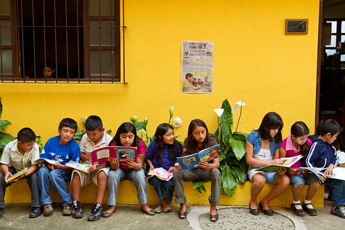
Ventanas Abiertas – San Miguel Dueñas, Guatemala – Canon 7D, 16-35mm f.2.8L II at 35mm, ISO 200, f/5, 1/100s

The Photo: As the first example photo, I’ve chosen the full, original version of the current header image of this blog (also seen just above), a line of kids reading in the courtyard of Ventanas Abiertas, an after-school learning center in San Miguel Dueñas, Guatemala. I traveled to this NGO near Antigua in November of 2009 to photograph the center, its founder, teachers and students, and its work in the community. I created this strip of images showing select photos from the series as I worked towards finding and making this image:

The Process: As I roamed the center taking photos, I spotted the kids all lined up on a curb in the courtyard, reading. The linear composition and the striking yellow wall made for a pretty obvious opportunity. I had a Canon 16-35mm f/2.8L II lens on a Canon 7D, with a protective UV filter on the lens. I first took a shot from a standing position, composing the image with the kids across the center of the frame. The focal length of the lens was at 23mm, a wide shot to capture the whole scene. That shot has a bit of a snapshot look, and didn’t take full advantage of the yellow wall, had far too much of the grey concrete patio, and created too static of a composition which did not make use of the opportunity to apply the rule of thirds for a more dynamic composition. I re-framed to move the line of kids to the bottom third of the frame, and still had the lens wide and was standing. To better fill the frame with just the kids and to create a better point of view, more on the level of the kids, I crouched down and zoomed in to 35mm. Although the 35mm focal length is a wide angle and thus prone to distortion, due to my camera to subject distance there is only a slight amount of distortion in the image. If I had moved closer to the subjects, more distortion would have been obvious. At this point I checked my settings and saw I was at ISO 400 from the previous shots in the shade, so I lowered it to ISO 200 since the late afternoon light was still pretty bright. The lowest ISO possible for the given situation will typically create a higher quality image file. For all the shots I was using Aperture Priority mode. I almost always use Av mode unless i am dealing with motion or blur that needs to be controlled (then I use Tv mode), or am using the flash in a controlled situation (and then I often use Manual, M mode). The aperture was set at f/5.0 to give me a relatively shallow depth of field, but enough so that the kids and the wall behind them were all in focus, but anything inside the doorway and window would be a bit blurry and thus less distracting. Unlike most of my images, the aperture setting wasn’t critical here, as the depth of the entire image is mostly all within a couple feet, from the kids’ toes to the wall behind them. So f/4.0 or f/8 would have given me virtually the same image. At ISO 200, the shutter speed was at 1/80 or 1/100, which was fast enough for handholding. A little faster would have been better to ensure there was no blurring if a child moved their head or hands during a shot, so leaving the camera set on ISO 400 would not have been a mistake.

As you can see in the first several photos, many of the kids were aware of me taking their photo, and were posing, goofing, or self conscious. I continued to take a few shots and waited for them to begin to ignore me. I liked the composition, and the window and the doorway to anchor the sides of the frame, so I continued to take the same shot, attempting to get the best moment of poses and facial expressions. I attempted to keep the image straight, aided by the lines visible in the viewfinder of the 7D. For all of the shots, I manually selected an auto-focus point, using a point below the central focus point which would line up on or near the face of one of the central kids. This would take advantage of the nice contrast between the dark hair and the lighter face to ensure proper auto-focus. By selecting an AF point exactly where I wanted to focus, I didn’t have to worry about focusing or have to re-frame each subsequent shot. The exposure metering was set on evaluative. The bright yellow wall could have easily messed with the metering, and I’m sure another camera like my 50D would have miscalculated the exposure based on the wall, but the 7D performed nicely on this mode. I checked my histogram a couple times to make sure I wasn’t blowing out any highlights and thus needing to use exposure compensation to adjust for that.

Douglas J. Klostermann Photography
The Final Image: Canon 7D, 16-35mm f.2.8L II at 35mm, ISO 200, f/5, 1/100s

I took a series of 19 images of this same scene, over 1 minute and 12 seconds. As you can see, it didn’t take long for the kids to begin to ignore my presence. My chosen shot was from the middle of this series, IMG_3068. It stood out among all the others in the poses, positions, groupings, and facial expressions of all the kids. Throughout the time of the series, a head appeared in the window, and people moved around inside the doorway. Luckily with my chosen shot, the head was in the window, as I like this subtle, almost hidden detail. I liked the bit of green from the plant on the left, but my chosen shot unfortunately doesn’t show much of it.

The Post-Process: To create the final image, I adjusted the color and contrast in Adobe Camera RAW (ACR). I had shot the image in RAW for maximum quality and processing latitude. Due to the available light of the scene and the proper exposure, it required little processing. I set the Temperature at 4600 and the Tint to 8. I adjusted Recovery to 5 to bring back some of the detail of the yellow wall which was very slightly blown out, Fill to 15 to lighten up the children’s clothes, Brightness stayed at the standard 50, I set Contrast to 20 with plans to increase it a bit more in Photoshop. Clarity 20, Vibrance 15, and Saturation 0. I like a bit of color saturation, vibrance, and contrast in my images, but I prefer not to overprocess or to make the adjustments obvious. While the yellow of these images is definitely vibrant, especially compared to the dull, neutral RAW images, it is a realistic representation of the actual color. Typically I straighten and maybe crop a bit in ACR, but miraculously this shot was very level, and also left no room for cropping. In Photoshop I used Curves to adjust the contrast somewhere between the Linear and Medium presets, and used Unsharpen Mask to sharpen. I don’t know what my exact settings were, but I had to use aggressive sharpening because the Canon 7D I used had a severe front-focusing problem. The settings were probably Amount: 175 or 200, Radius: 1.8, and Threshold: 4.

The Lesson: We should always learn from our photos, so that next time we are in a similar situation, we can create an even better image. Some improvements I could have made to this image include possibly crouching or sitting even lower to be more on level with the kids faces (although this would have caused keystoning of the vertical lines), eliminating the doorway at right by either re-framing or moving slightly to the left (which would cut out a child or two on the right) or moving to my right and shooting back towards them at a slight angle, but this would have affected the straight-on view which I feel is important to this composition. I would not have minded a little more of the green plant on the left in the frame. The image demonstrates the importance of keeping the camera level and the sensor parallel to the subject to avoid unwanted distortion. The best way to keep the horizontal and verticals straight while taking the photo is to make sure the camera is not tilted up or down and that the sensor is parallel to the wall. This involves moving yourself and the camera up or down to get the framing you desire. Also, in post-processing, I could have used the lens correction menus in ACR or Photoshop to perfectly straighten all the verticals and horizontals. Finally, although the color looks good, now I would have paid more attention to adjusting the Temperture and Tint, or adjusting the white balance using Curves in Photoshop because I have experimented and learned a bit more about these settings since then. Also, now that I see IMG_3074 again, (the last one in the strip above) I like it a lot, and should probably process that one and add it to my collection of final images.

So hopefully you can see from this explanation and from my previous post that photographs don’t necessarily just happen. They are created through a combination of thought processes, a series of decisions, and the application of camera settings based on these decisions and on the situation at hand.

See the Related Posts section just below for links to parts 2 and 3 in this series.

And learn more about how to take control of your camera and the images you create with my Full Stop e-book camera and photography guides.
Full Stop photography e book camera user guide Nikon Canon dSLR